At StudyForge, we have been fortunate enough to rub shoulders with thousands of fantastic online educators over the last 10+ years. When we do, we talk a lot about how important it is to design online courses in ways that make students’ brains happy.
Teachers have been trained in pedagogical principles and developmental psychology, but few of them have ever taken a course in visual design. After all, what’s important is the instructional design, right? Who cares what it looks like as long as all the information is there? What’s important is the quality of the information.
The results of this kind of thinking are a little harrowing, especially from the perspective of a visual designer. Probably every teacher out there has a Comic-Sans worksheet skeleton in their past.
Even if teachers are not trained in visual design, though, there are some basic rules and principles that can be helpful for your students. Ignoring these rules might not seem like a big deal, but you might unintentionally be making learning more difficult for them.
Here are five visual design principles that every online teacher should know.
1.) Pay Attention to Hierarchy
Whether you are creating a lesson page, a worksheet, or an online video, know ahead of time what the most important things on your page are going to be. What do you want to emphasize? What is of secondary importance? Assign a hierarchy to the most important information or visual elements and feature these most prominently.
In terms of layout design, this will include having headings that are bigger and more emphasized than the body text.
Be careful not to emphasize everything, though. If you use bold text for 50% of your lesson, you are actually making that text less emphasized. It’s like a highlighter in your textbook: If you highlight everything, you might as well highlight nothing. Limit the amount of bold text, italic text, or highlighted text that you use, saving your emphasis for the things that need it most.
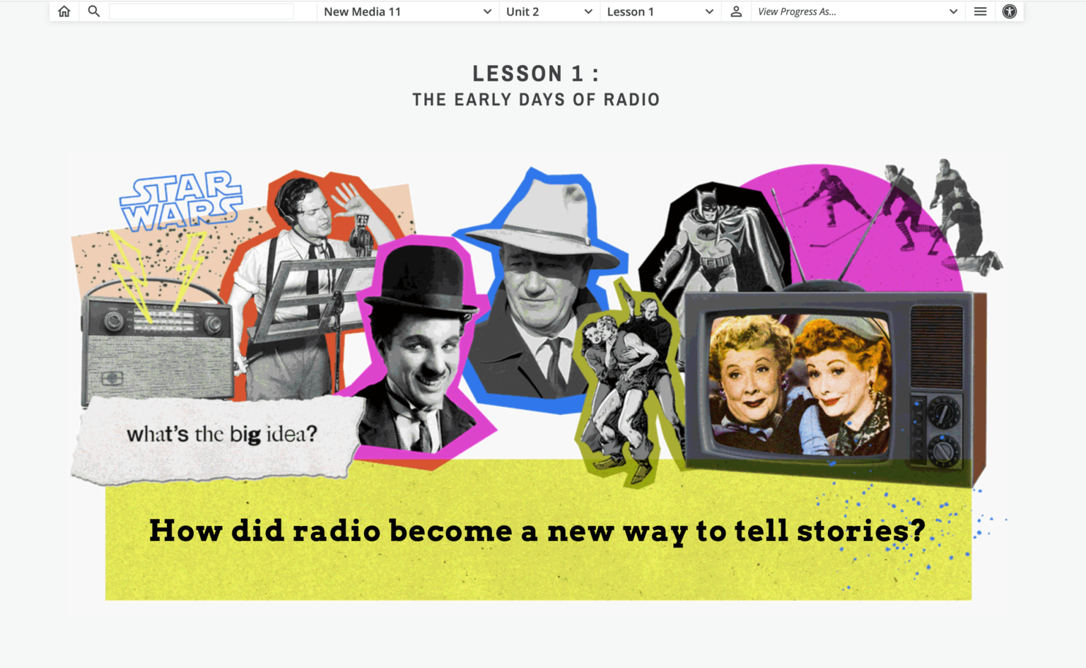
Notice the use of hierarchy below in StudyForge’s New Media 11 lesson.
2.) White Space is NOT a Waste of Space
Allow breathing room.
White space is an organizational tool that can help group information together or disassociate topics from each other.
Imagine you have a bunch of information about biology that is all in one paragraph, but there are two distinct topics within your lesson — genetics and adaptations. The topics are related, but you are treating them as distinct topics. The white space separates the information and helps to organize it in the mind of your students. Group similar content together and separate distinct content using white space.
Let’s say you want to emphasize a single phrase or quote. You could have a paragraph of information.
Then write the most important information, separating it with white space.
Continue on your way, and you have just provided emphasis on that important information. This way, you are doing some of the organizing work for your students. They are trying to absorb and understand new information. By organizing it for them, you are making it easier for students to organize it in their brains. Bolding that one line was a visual cue to your students that this was something they should pay attention to. Adding the white space makes it stand out even more.
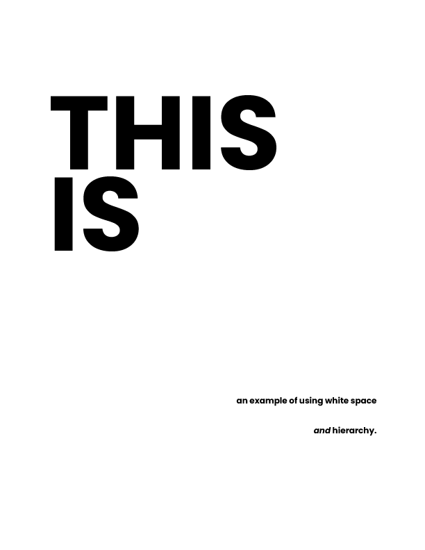
The example below shows white space being used to present calm and bring attention to specific words or objects.
3.) Variety
Break up the wall of text by bringing in some color or some visual aids. Reinforce whatever is going on in the paragraph or the content with pictures, charts, or decorations. This is helpful for visual learners, of course, but it is helpful for all learners because we want to create an imprint in students’ minds of whatever it is that we’re talking about. Visual learners in particular, though, need to be able to correlate what they are reading with what they are looking at. A wall of text cannot do that.
We recently designed a Social Studies 8 course that covers the Middle Ages. One of our visual designers drew an image of the different stages that houses went through as they were being constructed.
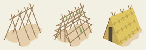
This quick visual accomplishes a lot:
- It keeps the students from shutting their brains off as they wade through a wall of text.
- It provides a prompt for the course material when they review it in the future.
- It gives students a more vivid memory of what medieval houses were like, allowing them to make important connections to their learning.
You don’t need to be a great artist to do this. There are many free items available online that you can insert into your text to provide variety and color, all of which can reinforce the material that students are learning. With a wall of text, students might just shut their brains off, but with the introduction of visual aids or variety, you can create intrigue for different learner types.
4.) Alignment and Balance
One of my teacher colleagues tells me that when he is teaching on a white board, he will use a mind web, putting the main idea in the center, and then drawing a web of associated topics and ideas from there. However, while this may be a good way to brainstorm for a project, it is not the best way to communicate complex information to students.
StudyForge has hundreds of meticulously designed whiteboard videos. When we make these videos, we are trying to help students organize the new information they are learning by using alignment and balance. We are not just scattering information onto the screen using a mind web.
- Alignment is organizing information into columns that all start at the same height. By doing this and separating them with white space, the student is able to see that there are distinct ideas that they need to know about. This also is doing some of the organization work for students, decreasing the cognitive load and allowing them to absorb the information more easily.
- Balance means making sure that information of equal importance is given equal space. If you have two containers of information, and one is way bigger than the other, this is telling the students that one container of information is more important than the other. Ideally, these should be more balanced if they are of equal importance.
The way that you present information communicates a message about that information’s importance, even if your students are not consciously aware of that. For example, if you have a video whiteboard layout and you have divided it into columns, but one column is far wider than the others, you have told the students that this information in the largest container is the most important. That might not be true, so be aware that if you want each piece of information that you are communicating to be of equal importance, they need to be given equal importance on the page.
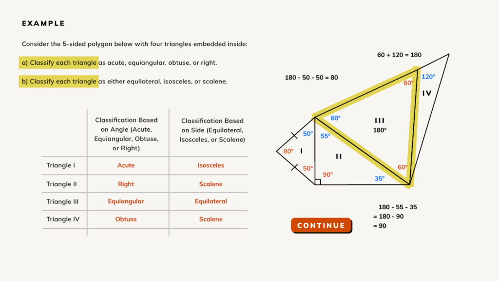
Here is an example of a whiteboard video layout. Notice that:
- There is alignment because information is separated into columns
- Balance is given to both columns of the information by scale
- Color is used to emphasize certain words and shapes
5.) Movement
Movement draws attention. This is one of the things that makes StudyForge’s videos an effective teaching tool. They employ this principle to help direct students’ eyes to the information they need to see next. A whiteboard video makes applying this principle a little easier than a static web page, because you can make a connection from one set of information to another and direct the viewer’s eye through animation.
One simple way to do this is to draw a line or an arrow to the next set of information that you would like students to be aware of, and then start talking about that. Be obvious about it. Lead the viewer to where you want them to see things according to the hierarchy of information.
With a whiteboard video, movement is established because not all of the information is on the screen at the beginning of the video. Instead, you are starting from a blank page and adding information as you go. By moving off of the previous content and going to a new space, you are leading the viewer to see what you want them to see. Do not start with all of the text and images on screen at the beginning. Instead, add items one at a time, directing the attention of the viewer to whatever you want them to focus on at any given time.
Be aware that anytime something new happens on screen, that will draw the attention of the viewer. This is a good thing because it gives you, as the teacher, the power to draw the attention of your students to whatever is important at that moment of the lesson. Exploit this! Use movement to your advantage, because once something is in motion, it increases the amount of attention that it will receive.
We have employed this principle in our History 10 course. There is a key question at the beginning of every lesson, and we were concerned that this question could easily be skipped over by students as they rushed toward the lesson material and videos. To solve this problem, we animated the text to appear one letter at a time, using a courier font that gave the impression that something was being typed.
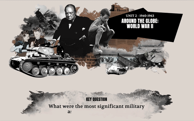
This simple HTML trick allowed students to see the question appear in front of them. The movement draws their eye and their attention so that the question is no longer something they will skip over.
Conclusion
Most online or hybrid teachers will not have a visual design team at their disposal, but even if you do not, some basic principles of design can be used to make your students’ brains happy, and make learning more effective.